Python Charts
Python Chart Grafiken lassen sich mit der Biblothek matplotlib leicht generieren.
Paket installieren: pip install matplotlib
Beispiel
Code:
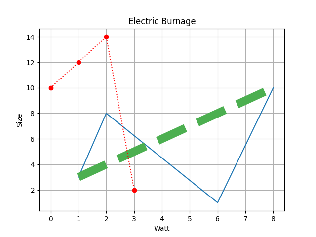
import matplotlib.pyplot as plt
import numpy as np

xpoints = np.array([1, 2, 6, 8])
ypoints = np.array([3, 8, 1, 10])
plt.plot(xpoints, ypoints)

plt.plot(np.array([1, 8]), np.array([3, 10]), linestyle='dashed', c = '#4CAF50', linewidth = '12')
plt.plot(np.array([10, 12, 14, 2]), 'o:r')


plt.title("Electric Burnage")
plt.xlabel("Watt")
plt.ylabel("Size")

plt.grid()
plt.show()
Ausgabe: